Nice to meet you, my name is Jorge Granado from SPEEDA Tech Team.
At UZABASE we are always trying to find new ways of surprising our clients, and provide them with new analysis tools as well as better data.
Since early 2013 we have been using Machine Learning algorithms for gathering world business news and information (both in English and Japanese), and connecting it to our company database. That way our clients can easily find all related media information whenever they lookup a company profile. Also, since October 2014, we have added M&A information to our existing data and, of course, linked the information with the mentioned database so all our information stays connected.
Currently listed corporation market prices are stored with a date key, and this also goes the same for news as well as M&A deals. Why not create a tool where one can see all events located in a stock market price timeline to study its influence? This time we will implement a quick prototype so the analyst team can evaluate the solution and decide on it.
1. Choosing a library for client data display
One of my personal mottos for quickly developing prototypes is the famous "do not reinvent the wheel" approach. So this time, we will try to find a third party library that:
- complies with maximum number of the requirements.
- can be extended to fulfil all the remaining necessities.
- has an affordable cost/performance value.
Those requirements are:
- being able to represent two or more time-related textual (but independent) events over a time-based data series.
- being able to display the textual data over the numerical series in a readable manner.
- being able to enlarge/reduce the period shown to the user in an intuitive way.
- compatible with most of the current browsers as well as old ones.
As for the last requirement, when your clients are not responsible for the software they can have in their computers and they are tied to corporate rules, you want to support them as much as possible. Remember, clients first. Yes, unfortunately that means that our website should appear 90% or better even for the old IE6 whenever possible.
Although there are several useful framework/libraries available for combining data and time-organized information, seems like there are not so many options to accomplish most of our requirements in an out-of-the-box manner. Best candidates are:
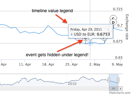
Highcharts: really interesting commercial library, with support for old browsers. The annotated timeline present some problems for our project, especially regarding UI such as:
- event data can only be accessed over the graph, cannot be shown separately.
- event flags appear really close to the graph, and that makes them difficult to click and read.
Google Annotation Chart: part of the Google Charts library.
- can show only one event stream per data graph, although more than one graph can be added to the visualization.
- events are shown in a separated table, although only one column can be shown.
- events are not html links by default, this has to be extended.
Some other interesting libraries are:
- Rickshaw: no default annotation support, development is needed. Old browser support not available.
- C3: impressive library, but fails same as previous.
- SIMILE widgets
- Dygraphs although supports annotated timelines, some development would be needed to create an intuitive and friendly visualization.
So finally, Google chart has been chosen, at least for this prototype phase.
2. Creating a basic data service for first test
For the first interaction test we have created a simple JSON format which will be received in the browser to show the data. At this point, we will try to show only news headlines and we will expand the model later.
The JSON format is as follows:
  {"article_list":
    [
      {
        "date": "YYYY-MM-dd",
        "value": 1234,
        "headline": "String with the news headline"
      },
      ...
    ]
  }
This will allow us to quickly interact with the graphic library, check the complexity for using the data and inspect the final results.
Note: "value" can be empty or not, depending on that day stock price. "headline" can be empty is there is a stock price for that day, but no news.
At SPEEDA we use Apache Wicket for the platform development. So in order to create a REST service, we will code a simple JSON Resource entity extending AbstractResource. To be able to access the service, the final class that extends from our JSONResource will be mounted in our main application class.
Note: resources do not check for user authorization by default, this will have to be implemented in our final resource class in the "getData" method.
package com.uzabase.speeda.web.resource;

import javax.servlet.http.HttpServletResponse;

import org.apache.wicket.request.Response;
import org.apache.wicket.request.resource.AbstractResource;
import org.apache.wicket.request.resource.ContentDisposition;

public abstract class JSONResource extends AbstractResource {

    private static final long serialVersionUID = 1L;
    private final String contentType = "application/json";

    @Override
    protected ResourceResponse newResourceResponse(final Attributes attributes) {
        final ResourceResponse response = new ResourceResponse();
        response.setContentType(this.contentType);
        response.setTextEncoding("UTF-8");

        final String data = getData(attributes);
        if (data == null) {
            response.setError(HttpServletResponse.SC_NOT_FOUND);
        } else {
            Long length = getLength(data);
            if (length != null) {
                response.setContentLength(length);
            }
            if (response.dataNeedsToBeWritten(attributes)) {
                response.setContentDisposition(ContentDisposition.INLINE);
                response.setWriteCallback(new WriteCallback() {
                    @Override
                    public void writeData(final Attributes attributes) {
                        JSONResource.this.writeData(attributes.getResponse(), data);
                    }
                });
            }
        }

        return response;
    }

    protected abstract String getData(Attributes attributes);

    protected void writeData(Response response, String data) {
        response.write(data);
    }

    protected Long getLength(String data) {
        return (long) data.length();
    }
}
3. Data adjustements
Ok, let's add some Javascript code to the template at Google site to process our JSON data:
google.load('visualization', '1', {'packages':['annotationchart']});
google.setOnLoadCallback(drawChart);
var chart = null;
function drawChart() {
  var data = new google.visualization.DataTable();
  data.addColumn('date', 'Date');
  data.addColumn('number', 'Stock value');
  data.addColumn('string', 'News title');

  var node, date_parts, date, value, headline;
  for (i = 0 ; i < myJSONObject.article_list.length;i++) {
    node = (myJSONObject.article_list[i]);
    date_parts = node["date"].split('-');
    date = new Date(parseInt(date_parts[0]), parseInt(date_parts[1]) -1, parseInt(date_parts[2]));
    value = node["value"] == undefined ? 0 : parseFloat(node["value"]);
    headline = node["headline"] == undefined ? "" : node["headline"];

    if (value > 0) {
      data.addRows([[date, value, headline]]);
    }
  }
  chart = new google.visualization.AnnotationChart(document.getElementById('chart_div'));

  var options = {
    displayAnnotations: true,
  };

  chart.draw(data, options);
  google.visualization.events.addListener(chart, 'select', selectHandler);

}
Don't forget to add a request in the Javascript code to interact with the server and retrieve the JSON!
And the result...
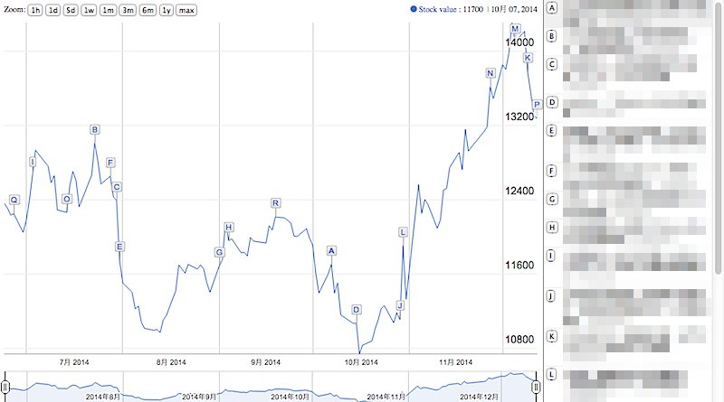
Ooops! Looks like we have to order our event list, otherwise the flags over the timeline look odd... We can easily order the returned array in the server side
...
  JSONArray entryPoints = new JSONArray();
  String[] sortedKeys = annotatedValues.keySet().toArray(new String[0]);
  Arrays.sort(sortedKeys, Collections.reverseOrder());
  for (String entry : sortedKeys) {
      entryPoints.add(annotatedValues.get(entry).asJSON());
  }
  JSONObject response = new JSONObject();
  response.put("article_list", entryPoints);

  return response.toString();
But this also can be done in the client side and save some memory in the server ;)
var ordered_array = myJSONObject.article_list.sort(function(a,b) {return -1 * a["date"].localeCompare(b["date"])});
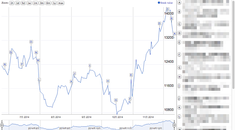
Much better! :)
4. Add deals and extend timeline
Now for the remaining part, let's extend the JSON model to support deal data:
  {"data":
    [
      {
        "date": "YYYY-MM-dd",
        "value": 1234,
        "news_headline": "String with the news headline",
        "news_id": "String with the article ID",
        "deal_headline": "String with the news headline",
        "deal_id": "String with the deal ID"
      },
      ...
    ]
  }
and modify the Javascript to process the new data
var data = new google.visualization.DataTable();
data.addColumn('date', 'Date');
data.addColumn('number', 'News');
data.addColumn('string', 'News title');
data.addColumn('string', 'News headline');
data.addColumn('number', 'Deal');
data.addColumn('string', 'Deal title');
data.addColumn('string', 'Deal headline');

var ordered_array = myJSONObject.article_list.sort(function(a,b) {return -1 * a["date"].localeCompare(b["date"])});
var node, date_parts,date, value, headline_news, title_news, headline_deal, title_deal;
for (i = 0 ; i < ordered_array.length;i++) {
  node = (ordered_array[i]);
  date_parts = node["date"].split('-');
  date = new Date(parseInt(date_parts[0]), parseInt(date_parts[1]) -1, parseInt(date_parts[2]));
  value = node["value"] == undefined ? 0 : parseFloat(node["value"]);
  headline_news = node["news_headline"] == undefined ? "" : node["news_headline"];
  title_news = node["news_headline"] == undefined ? "" : "News";
  headline_deal = node["deal_headline"] == undefined ? "" : node["deal_headline"];
  title_deal = node["deal_headline"] == undefined ? "" : "Deal";

  if (value > 0) {
    data.addRows([[date, value, title_news, headline_news, value, title_deal, headline_deal]]);
  }
}
What we are doing is adding a new graph over the first one (with the same values) and then attach the deal flags to it. Not the perfect solution, but this way we can see both news (blue) and deals (red). And it is good enough for a prototype.
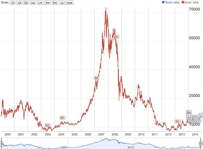
Looks like most of our data is somewhat recent. To tell the library to show only the last 6 months at the beginning there is a useful option:
var d = new Date();
d.setMonth(d.getMonth() - 6);

var options = {
  displayAnnotations: true,
  zoomStartTime: d
};
And then it looks much more useful :)
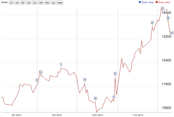
Finally, we put our Javascript code in a blank Wicket page and the prototype is ready to be shown!
There is still some pending job:
- a market selector (as public companies may appear in more than one stock market).
- a data filter (to be able to shown either "news" or "deals", or both).
- a function to capture the clicks in the data table and open the article body (using google.visualization.events.addListener).
but as a prototype is good enough to be shown at the next department meeting.
\(^▽^*) お疲れ様でした!