こんにちは。NewsPicks Androidアプリエンジニアの sefwgweo です。 今回は前回記載した以下のうち、5の「仕様や要件が複雑な様々なモジュール」について具体例をもとに紹介します。
- 不定期におきるリニューアル
- 動画配信システムとの連携
- 課金周り
- 多種多様なログ要件
- 仕様や要件が複雑な様々なモジュール
- 高度なデザイン要件
概要
■ベース要件
RecyclerView内の1アイテム(スライドアイテムと定義します)として表示可能なこと
画像(スライドコンテンツと定義します)をN枚(3枚以上10数枚程度以下)カルーセルとして表示すること
追加要件について、以下状態別画像に対して対応する数字を記載しました


■追加要件
①スライドコンテンツを、カードUIの上にフロート表示すること
②スライドコンテンツの横幅は端末の90%とし、スワイプ時は所定の位置で表示が止まっていること
③スライドアイテム上に、現在表示されているポジションが相対表示されていること
④インジケータはInstagram風に、インジケータ数は画像数が多くても5以上にならずインジケータサイズで残状態を表現していること
⑤左端の画像は左上のみ角丸に、右端の画像は右上のみ角丸にし、背後のカードUIとRadiusを合わせて表示すること
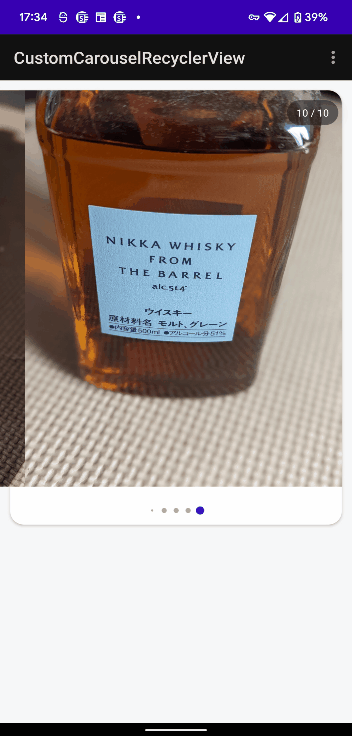
実際の挙動(アニメーションGIF)
どのへんが難しかったか
仕様①、②についてはOSで用意されているAPIで実現可能でしたので特筆事項なしです
③は意外に簡単に出来るかと思いきやそこそこ面倒でした(後述)
④については自作も考えましたがライブラリに頼らせていただきました
本件最難関は⑤の、画像の特定の場所だけ角丸に切り取るという要件でした(因みにiOSがサクッと実装済みだったのもありサーバサイドから予め所定部分が角丸になった画像を返してもらうことは出来なかったです)
当時はShapeableImageViewもなかったので、画像を角丸にするライトな手段としてはCardViewとGlide以外思い浮かばなかったわけですが、それが原因で(CardViewには特定箇所のみ角丸にするような機能は存在しない)困難な道へとつながっていきます(Glideはバージョンの関係で頓挫、material-components1.1.0以降でMaterialCardViewならばstyleを当てれば実現可能という記事も試しましたがうまく動作せずでした)
ではどう実現したかをここからはコードを見つつ解説していきます
XMLからいきます
スライドアイテムの一番左端のXML: header_item.xml
要件⑤を満たすための工夫として、MaterialCardViewでImageViewを囲っています
<?xml version="1.0" encoding="utf-8"?>
<layout xmlns:android="http://schemas.android.com/apk/res/android">

    <!-- 画像を角丸に切り取るためのカードView -->
    <com.google.android.material.card.MaterialCardView
        android:id="@+id/thumbnail_container"
        android:layout_width="match_parent"
        android:layout_height="match_parent"
        android:clipChildren="false"
        android:clipToPadding="false"
        android:theme="@style/Theme.MaterialComponents.Light">

        <androidx.appcompat.widget.AppCompatImageView
            android:id="@+id/image"
            android:layout_width="0dp"
            android:layout_height="match_parent"
            android:contentDescription="@null"
            android:scaleType="centerCrop" />
    </com.google.android.material.card.MaterialCardView>
</layout>
スライドアイテムの一番右端のXML: footer_item.xml
要件⑤を満たすための工夫として、header_item.xml同様MaterialCardViewでImageViewを囲っています
<?xml version="1.0" encoding="utf-8"?>
<layout xmlns:android="http://schemas.android.com/apk/res/android">

    <!-- 画像を角丸に切り取るためのカードView -->
    <com.google.android.material.card.MaterialCardView
        android:id="@+id/thumbnail_container"
        android:layout_width="match_parent"
        android:layout_height="match_parent"
        android:clipChildren="false"
        android:clipToPadding="false"
        android:theme="@style/Theme.MaterialComponents.Light">

        <androidx.appcompat.widget.AppCompatImageView
            android:id="@+id/image"
            android:layout_width="0dp"
            android:layout_height="match_parent"
            android:contentDescription="@null"
            android:scaleType="centerCrop" />
    </com.google.android.material.card.MaterialCardView>
</layout>
スライドアイテムの両端以外のXML: col_item.xml
両端以外のスライドコンテンツ表示時、elevationを設定して両端よりも上にコンテンツを配置します(後述)
<?xml version="1.0" encoding="utf-8"?>
<layout xmlns:android="http://schemas.android.com/apk/res/android"
    xmlns:app="http://schemas.android.com/apk/res-auto">

    <androidx.constraintlayout.widget.ConstraintLayout
        android:id="@+id/container"
        android:layout_width="match_parent"
        android:layout_height="wrap_content"
        android:clipChildren="false"
        android:clipToPadding="false"
        android:elevation="@dimen/elevation_ss">

        <androidx.appcompat.widget.AppCompatImageView
            android:id="@+id/image"
            android:layout_width="match_parent"
            android:layout_height="wrap_content"
            android:contentDescription="@null"
            android:scaleType="centerCrop"
            app:layout_constraintEnd_toEndOf="parent"
            app:layout_constraintStart_toStartOf="parent"
            app:layout_constraintTop_toTopOf="parent" />

    </androidx.constraintlayout.widget.ConstraintLayout>
</layout>
スライドアイテムを表示するためのXML: fragment_custom_carusel_list.xml
カードUI、スライドアイテム、スライドコンテンツ位置相対表示、instagram風インジケータで構成されています
カードUIに影をつけるためelevationを指定しています
カードUIの上にフロート表示させる仕様①のためにRecylerViewにelevationをカードUIより大きく指定しています
<?xml version="1.0" encoding="utf-8"?>
<layout xmlns:android="http://schemas.android.com/apk/res/android"
    xmlns:app="http://schemas.android.com/apk/res-auto"
    xmlns:tools="http://schemas.android.com/tools">

    <androidx.constraintlayout.widget.ConstraintLayout
        android:layout_width="match_parent"
        android:layout_height="wrap_content">

        <!-- モジュールの下地となるカードView -->
        <androidx.cardview.widget.CardView
            android:id="@+id/card_container"
            android:layout_width="0dp"
            android:layout_height="0dp"
            android:layout_marginHorizontal="@dimen/margin_m"
            android:layout_marginBottom="@dimen/margin_s"
            android:elevation="@dimen/elevation_s"
            app:cardBackgroundColor="@color/white"
            app:cardCornerRadius="@dimen/card_radius"
            app:layout_constraintBottom_toBottomOf="parent"
            app:layout_constraintEnd_toEndOf="parent"
            app:layout_constraintStart_toStartOf="parent"
            app:layout_constraintTop_toTopOf="@+id/list" />

        <!-- カルーセルのRecyclerView -->
        <androidx.recyclerview.widget.RecyclerView
            android:id="@+id/list"
            android:layout_width="match_parent"
            android:layout_height="480dp"
            android:layout_marginTop="@dimen/margin_m"
            android:layout_marginBottom="@dimen/margin_m"
            android:clipToPadding="false"
            android:elevation="@dimen/elevation_m"
            android:orientation="horizontal"
            android:paddingHorizontal="@dimen/margin_m"
            app:layoutManager="androidx.recyclerview.widget.LinearLayoutManager"
            app:layout_constraintBottom_toTopOf="@+id/indicator"
            app:layout_constraintEnd_toEndOf="parent"
            app:layout_constraintStart_toStartOf="parent"
            app:layout_constraintTop_toTopOf="parent" />

        <!-- インデックス表示用 -->
        <FrameLayout
            android:id="@+id/position_container"
            android:layout_width="60dp"
            android:layout_height="30dp"
            android:layout_marginTop="@dimen/margin_m"
            android:layout_marginEnd="@dimen/margin_l"
            android:background="@drawable/bg_rect_black_radius_100_alpha"
            android:elevation="@dimen/elevation_m"
            app:layout_constraintEnd_toEndOf="parent"
            app:layout_constraintTop_toTopOf="@+id/list">

            <TextView
                android:id="@+id/position_text"
                android:layout_width="match_parent"
                android:layout_height="wrap_content"
                android:layout_gravity="center"
                android:gravity="center"
                android:textColor="@color/white"
                android:textSize="@dimen/string_m"
                tools:text="11/13" />
        </FrameLayout>

        <!-- instagram風インジケータ -->
        <ru.tinkoff.scrollingpagerindicator.ScrollingPagerIndicator
            android:id="@+id/indicator"
            android:layout_width="wrap_content"
            android:layout_height="wrap_content"
            android:layout_marginVertical="@dimen/margin_m"
            android:elevation="@dimen/elevation_m"
            app:layout_constraintBottom_toBottomOf="@+id/card_container"
            app:layout_constraintEnd_toEndOf="parent"
            app:layout_constraintStart_toStartOf="parent"
            app:layout_constraintTop_toBottomOf="@+id/list"
            app:spi_dotSelectedColor="@color/blue" />

    </androidx.constraintlayout.widget.ConstraintLayout>
</layout>
続いてKotlinファイル
スライドアイテムの左端Item用: HeaderItem.kt
(i)で仕様②を満たすように値をセットしています
(ii)で仕様⑤を満たすように加工しています。ポイントはViewOutlineProviderを用いて元画像よりも下にRadius分、右にRadius分大きくクリップすることです
こうすることで、左上だけ角丸に出来ます
両端以外のスライドコンテンツ用XMLでelevationを設定していた理由はこの(ii)の処理が入ることで、両端のItemの隣のコンテンツに切り取りViewがでてしまうのを防いでいます
class HeaderItem(
    @DrawableRes private val resId: Int,
    private val width: Int,
    private val radius:Int
) : BindableItem<HeaderItemBinding>() {
    override fun getLayout() = R.layout.header_item

    override fun bind(viewBinding: HeaderItemBinding, position: Int) {
        viewBinding.thumbnailContainer.layoutParams.width = width // (i)Fragmentから端末横幅の90%の値を受け取り、反映
        viewBinding.image.layoutParams.width = width // (i)Fragmentから端末横幅の90%の値を受け取り、反映
        viewBinding.image.setImageResource(resId)
        makeCustomOutline(viewBinding.thumbnailContainer) // (ii)makeCustomOutlineメソッドにより、左上だけ角丸になるように加工
    }

    // 一番左の画像を、左上だけ角丸にするための処理
    private fun makeCustomOutline(card: CardView) {
        card.outlineProvider = object : ViewOutlineProvider() {
            override fun getOutline(view: View, outline: Outline) {
                outline.setRoundRect(
                    0,
                    0,
                    view.width + radius,
                    view.height + radius,
                    radius.toFloat()
                )
            }
        }
        card.clipToOutline = true
    }
}
スライドアイテムの右端Item用: FooterItem.kt
(i)で仕様②を満たすように値をセットしています
(ii)で仕様⑤を満たすように加工しています。ポイントはViewOutlineProviderを用いて元画像よりも下にRadius分、左にRadius分大きくクリップすることです
こうすることで、右上だけ角丸に出来ます
両端以外のスライドコンテンツ用XMLでelevationを設定していた理由はこの(ii)の処理が入ることで、両端のItemの隣のコンテンツに切り取りViewがでてしまうのを防いでいます
class FooterItem(
    @DrawableRes private val resId: Int,
    private val width: Int,
    private val radius: Int,
) : BindableItem<FooterItemBinding>() {
    override fun getLayout() = R.layout.footer_item

    override fun bind(viewBinding: FooterItemBinding, position: Int) {
        viewBinding.thumbnailContainer.layoutParams.width = width // (i)Fragmentから端末横幅の90%の値を受け取り、反映
        viewBinding.image.layoutParams.width = width // (i)Fragmentから端末横幅の90%の値を受け取り、反映
        viewBinding.image.setImageResource(resId)
        makeCustomOutline(viewBinding.thumbnailContainer) // (ii)makeCustomOutlineメソッドにより、右上だけ角丸になるように加工
    }

    // 一番右の画像を、右上だけ角丸にするための処理
    private fun makeCustomOutline(card: CardView) {
        card.outlineProvider = object : ViewOutlineProvider() {
            override fun getOutline(view: View, outline: Outline) {
                outline.setRoundRect(
                    -radius,
                    0,
                    view.width,
                    view.height + radius,
                    radius.toFloat()
                )
            }
        }
        card.clipToOutline = true
    }
}
スライドアイテムの両端以外のItem用: CarouselImageItem.kt
(i)で仕様②を満たすように値をセットしています
class CarouselImageItem(
    @DrawableRes private val resId: Int,
    private val width: Int,
) : BindableItem<ColItemBinding>() {
    override fun getLayout() = R.layout.col_item

    override fun bind(viewBinding: ColItemBinding, position: Int) {
        viewBinding.container.layoutParams.width = width // (i)Fragmentから端末横幅の90%の値を受け取り、反映
        viewBinding.image.setImageResource(resId)
    }
}
スライドアイテム部分を表現するためのクラス: CustomCarouselRecyclerFragment.kt
仕様③現在表示されているポジションが相対表示される仕組みを入れています
仕様④instagram風インジケータを追加しています
class CustomCarouselRecyclerFragment : Fragment() {
    companion object { fun create(): CustomCarouselRecyclerFragment = CustomCarouselRecyclerFragment() }

    private lateinit var binding: FragmentCustomCarouselListBinding
    private val groupAdapter = GroupAdapter<GroupieViewHolder<*>>()
    private val items = mutableListOf<BindableItem<*>>()
    private val carouselItemList = listOf(
        R.mipmap.item0,
        R.mipmap.item1,
        R.mipmap.item2,
        R.mipmap.item3,
        R.mipmap.item4,
        R.mipmap.item5,
        R.mipmap.item6,
        R.mipmap.item7,
        R.mipmap.item8,
        R.mipmap.item9,
    )

    private val displayRatio = 0.9 // カルーセルコンテンツ1つ1つの、端末に対する横幅表示割合

    interface OnSnapPositionChangeListener {
        fun onSnapPositionChange(position: Int)
    }

    override fun onCreateView(
        inflater: LayoutInflater,
        container: ViewGroup?,
        savedInstanceState: Bundle?
    ): View {
        binding = FragmentCustomCarouselListBinding.inflate(inflater)
        return binding.root
    }

    override fun onViewCreated(view: View, savedInstanceState: Bundle?) {
        super.onViewCreated(view, savedInstanceState)
        initUIComponent()
    }

    private fun initUIComponent() {
        binding.list.apply {
            setHasFixedSize(true)
            adapter = groupAdapter
            PagerSnapHelper().attachToRecyclerView(this)

            // 現在見ている画像位置を表示するための処理
            addOnScrollListener(
                SnapOnScrollListener(
                    PagerSnapHelper(),
                    SnapOnScrollListener.Behavior.NOTIFY_ON_SCROLL,
                    object : OnSnapPositionChangeListener {
                        override fun onSnapPositionChange(position: Int) {
                            binding.positionText.text = (position + 1).toString()
                                .plus(" / ")
                                .plus(groupAdapter.itemCount)
                        }
                    }
                )
            )
        }

        // instagram風インジケータ追加
        binding.indicator.attachToRecyclerView(binding.list)

        // 画像を端末横幅の90%のサイズで表示するための計算
        val width = (getDisplaySize().x * displayRatio).toInt()

        // 画像の角丸値をpixel値で取得
        val radius = resources.getDimension(R.dimen.card_radius).toInt()

        carouselItemList.mapIndexed { index, resId ->
            when(index) {
                // 一番左の画像用処理
                0 -> items.add(HeaderItem(resId, width, radius))

                // 一番右の画像用処理
                carouselItemList.size - 1 -> items.add(FooterItem(resId, width, radius))

                // 端っこ以外の画像用処理
                else -> items.add(CarouselImageItem(resId, width))
            }
        }
        groupAdapter.update(items)
    }

    private fun getDisplaySize(): Point {
        if (android.os.Build.VERSION.SDK_INT >= android.os.Build.VERSION_CODES.R) {
            val display = requireActivity().display
            val size = Point()

            @Suppress("DEPRECATION")
            display?.getSize(size)
            return size
        } else {
            @Suppress("DEPRECATION")
            val display = requireActivity().windowManager.defaultDisplay
            val size = Point()

            @Suppress("DEPRECATION")
            display.getSize(size)
            return size
        }
    }
}
追加要件③で出た、現在表示されている相対位置を表示する仕組みを実現するためのクラス: SnapOnScrollListener.kt
特筆事項無し
class SnapOnScrollListener(
    private val snapHelper: SnapHelper,
    private var behavior: Behavior = Behavior.NOTIFY_ON_SCROLL,
    private var onSnapPositionChangeListener: CustomCarouselRecyclerFragment.OnSnapPositionChangeListener? = null
) : RecyclerView.OnScrollListener() {

    enum class Behavior {
        NOTIFY_ON_SCROLL,
        NOTIFY_ON_SCROLL_STATE_IDLE
    }

    private var snapPosition = RecyclerView.NO_POSITION

    override fun onScrolled(recyclerView: RecyclerView, dx: Int, dy: Int) {
        if (behavior == Behavior.NOTIFY_ON_SCROLL) {
            maybeNotifySnapPositionChange(recyclerView)
        }
    }

    override fun onScrollStateChanged(recyclerView: RecyclerView, newState: Int) {
        if (behavior == Behavior.NOTIFY_ON_SCROLL_STATE_IDLE
            && newState == RecyclerView.SCROLL_STATE_IDLE) {
            maybeNotifySnapPositionChange(recyclerView)
        }
    }

    private fun maybeNotifySnapPositionChange(recyclerView: RecyclerView) {
        val snapPosition = snapHelper.getSnapPosition(recyclerView)
        val snapPositionChanged = this.snapPosition != snapPosition
        if (snapPositionChanged) {
            onSnapPositionChangeListener?.onSnapPositionChange(snapPosition)
            this.snapPosition = snapPosition
        }
    }
}
以上がコードによる全容です。プロジェクト的にShapeableImageViewを使えなくてかつ特定の箇所のみ角丸にしたい場合の1つの解として参考になれば幸いです。
以下に今回解説したもののリポジトリを載せておきます。
https://github.com/sefwgweo/CustomCarouselRecyclerView
まとめ
結構ニッチなケースについて取り上げてみましたがいかがだったでしょうか。 こちらの記事が同様の機能をこれから開発する開発者様の助けになり、また弊社のサービスに興味を持っていただけるきっかけになりましたら幸いです。
おわりに
ユーザベースではエンジニアを募集しています。ご興味ある方いらっしゃいましたらこちらからぜひご応募いただければと思います!